
Paris Luxury was created from the need of users to efficiently find luxury stores in Paris, as well as find famous sites such as the Eiffel Tower and Arc de Triumph. Paris is a busy tourist destination which usually means long lines, busy traffic, and a shortage of tickets and time. This is what makes Paris Luxury necessary. This app allows a user to choose from a list of stores or view an interactive map which gives precise locations of all stores and sites. Users can find the best route and add stores to a list so they don't miss an experience while on their trip to this beautiful city.

The redesign of Paris Luxury came about from a less than spectacular experience using the app. Each screen is outdated, extremely minimalistic, and has no branding besides a quick logo of the Eiffel Tower. Typography design was non existent as well, except for a header and this was also outdated. Users were expected to scroll through a grid of store names with no imagery, and each store location only had an address and store name, nothing else. A bug I found was that there was the option to see saved stored, but there was no way to save a store from the store page or from the map. I quickly realized an entire application revamp was needed.
1. Allow users to browse store locations and find them on an interactive map.
2. Provide more information on each locations page, such as hours, pricing, and images.
3. Allow users to make an itinerary to plan out their trip.


I found the target audience for this app were female travelers with enough disposable income to take trips outside of their country, who also love to plan and organize trips efficiently. Other target audience groups would include travelers of all genders, who enjoy fashion and historical sites, or exploring educational sites. The age range would encompass groups within the range of 18 to 60+. Travelers who are time conscious would be a great target for this application.


After gathering business requirements and doing user research, i began the defining process with this mind map to help me understand how I want users to go through the process of navigating the Paris Luxury app. I wanted to include all ideas, even if I didn't use them, such as the popular locations feature.

The location/store screen I found to be the most important page so I did go into more depth with my sketch so I could plan out how I would fit all of the information a user might need to see on this page. I also created a small sketch for the status bar since this is a huge way a user will navigate the app and I wasn't sure which items to include at first.


During the wire framing process I wanted to create a splash screen just to modernize the app a little, as well as create a way for user to log in or sign up so they can personalize the app a bit. I wanted to make the store browsing more visual for people who may not know location or store names, which is why the homepage is dedicated to large location cards. This also gives the user more information before clicking into a location page, allowing them to decide if it is the store or location they were looking for.
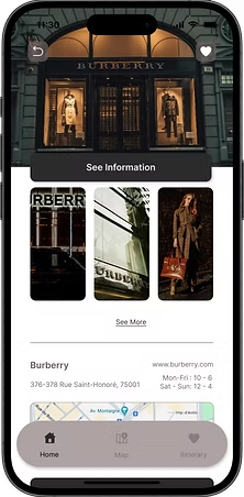
The location page wireframe includes many new features, such as a gallery of images, quick info that includes links to store/location webpage and hours, a quick view map to get a general idea of where the location is, and below all of this is three tabs. Overview, similar, and tips is where users can gather as much information as necessary to better plan their trip. This section includes important features such as traffic, popularity, and safety ratings.

TLDR: Customizable routes, efficient & reliable map, broad amount of information, & user generated tips.
Users want efficient and reliable information above all else when using these apps, but they also want to be able to customize with personalized routes, and saved locations.
Stats on traffic, popularity, safety, suggestions, tips, pricing, website, address, a map view, and hours of operation were needed to allow the user to make an informed decision before adding it to their itinerary.
The itinerary page allows a user to customize their map to show the route that they want to see. I felt this was important because I did not find another app that did this and I wanted the user to feel like they had control over their trip.
Navigation apps that focus on tourist destinations and street navigation was found to have a more outdated design and needs an update. Having an interactive map that provided a clean and organized way of viewing routes was extremely important when redesigning this app, which is why I included a branded marker which was unlike similar markers in a google map. Users wanted to see travel tips from both residents and travelers like themselves, so I included a comment section under each location which allows all users to provide tips rather than displaying tips that are generated by the owners of the app.